
Table of Content
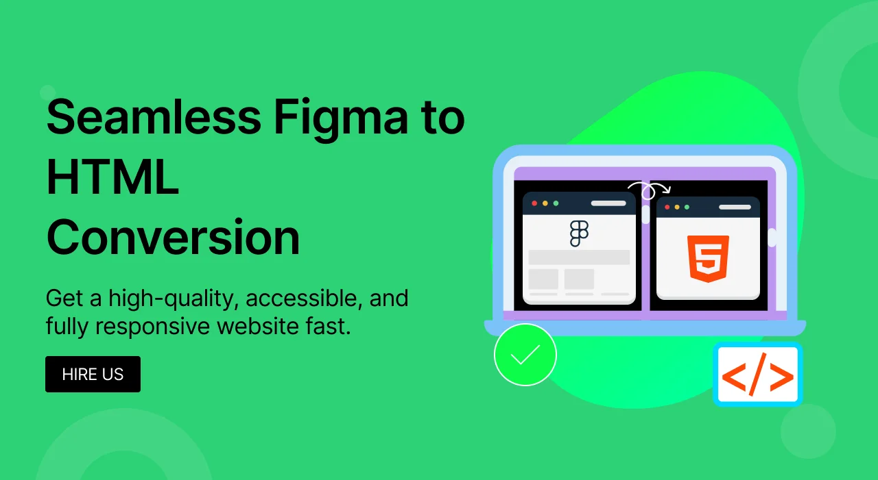
Transforming a beautiful Figma design into a fully functional, pixel-perfect website can seem daunting. If you've ever dreamt of seeing your Figma creations come alive on the web, but felt overwhelmed by the code, you're in the right place. This comprehensive guide will demystify the entire process, showing you exactly how to convert your Figma files into dynamic, responsive, and production-ready web pages using HTML and CSS.

While this tutorial is carefully crafted for beginners eager to dive into web development, it also emphasizesbest practices to ensure anyone—from aspiring developers to seasoned designers—can produce clean, performant, and maintainable code.
So, let’s jump into the exhilarating experience of converting our designs to reality through HTML and CSS!

Your Guide from a Figma Design to a Functional Webpage
Let's now explore the particular actions that will lead us from Figma design to a working homepage, having established the scene for our path. Every action is meant to build on the previous one thereby guaranteeing a seamless transition from idea to execution. The process looks like this:

Ready now? Let’s get started!
Step-by-Step Guide: Converting Figma Designs to HTML/CSS Code
Step 1: Getting Your Coding Setup Ready
Set up your coding environment before turning your Figma creations into HTML. Three main procedures will be discussed in this part: selecting the appropriate web browser and code editor and project file organization. Organizing these fundamental ideas will help the coding process go more smoothly and effectively, thereby guaranteeing your readiness to easily bring your ideas to life.
Step 2: Picking a Code Editor
First of all, for your Figma to HTML conversion project, decide on a code editor—visual studio code or Sublime Text to write code. This makes VSCode the best choice for front-end development projects for the large tools, extensions and capabilities available.
Apart from the fundamental demands of every developer, VS Code lets you effortlessly include other plugins (extensions), therefore transforming this code editor into a real web development powerhouse. The Sourcery addon, for instance, helps developers create easily debug- and update-able clean code, therefore enhancing the user experience generally.
In this course will be using VS Code.

Step 3: Choosing a Web Browser
Choose a web browser then to see your work as you create it. Your decision will rely on various elements, including your own taste, the particular criteria of your project, and the characteristics of many browsers. Among the usually utilized popular web browsers for UI development are Mozilla Firefox, Google Chrome, and Safari. We will be working for this session using Firefox.
Step 4: Organizing Project Files and Folders
At last, you have to arrange your workstation to facilitate quick and effective operation. Make a fresh folder for your project and arrange HTML, CSS, and any other assets—such as fonts or images—into the required files and folders.
In this tutorial, we will be utilizing this basic digital agency landing page, Figma design:

project-name/
│
├── assets/
│ ├── images/
│ │ └── (place your image files here)
│ ├── fonts/
│ │ └── (place your font files here)
│ └── css/
│ └── styles.css
│
├── index.html
└── README.md

Step 5: Converting the Figma Design Into a Working Webpage
Once your development environment is set up, it's time to transform the example Figma design into a full-fledged homepage.
In this part, we will go through each stage required to translate a notion in Figma into a fully working presence on the web. Before you begin writing a single line of code, you need first fully grasp the Figma design to make sure you know precisely what we are looking for.
You will start the fascinating process of converting that design into HTML, laying down the website's fundamental framework.
Finally, you will add all the visual flair—colors, styles, and layout changes that will make the homepage functional and visually spectacular using CSS.
Step 6: Analyzing the Figma Design
Analyzing the Figma project's design thoroughly is crucial before you begin coding. This method entails knowing the general layout and spotting the main elements of the site along with their dimensions.
Step 7: Breaking down the design into main sections
The web page has the header, hero section, footer, and other blocks as shown in the image below.

Step 8: Finding out the layout width
The design is created for a 1,920pixel width layout. This measurement is very important because it guarantees the design looks pixel-perfect on screens this size.
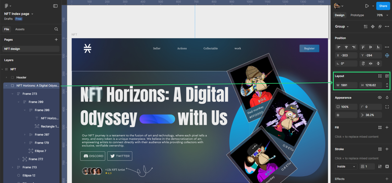
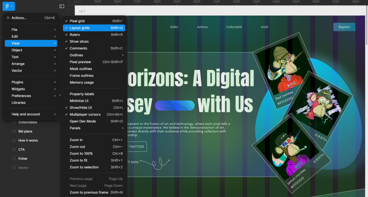
Step 9: Finding out the container’s size
Next, either by choosing the Layout grids option on the main menu or by using Shift+G on the keyboard, we must ascertain the size of the design container.
Here we have a 12 grid arrangement, which is somewhat typical in contemporary UI design. The container's dimensions fit the layout grid width at 1,170px using a 30px gutter or grid spacing.

Step 10: Inspecting the properties of the design components
Let's examine the features of its aspects and delve further into the design elements' intricacies. Among them are colors, margins, padding, backgrounds, picture sizes, etc.
Examining Figma designs should ideally start with turning on the Dev Mode.

One-click on any element, text, picture, or section now will show its CSS attributes on the right.


Later in the code, we will take advantage of all those aspects.
Step 11: Exporting the design assets
Another really important step we should do before we begin coding is exporting certain design elements like images and icons. Depending on your demands, you may choose from among many design forms including.png or.jpg with a reduced or higher quality.

NOTE: Anima is one of the Figma plugins you might use to convert Figma to HTML without doing it by yourself. That will definitely hasten growth. Remember, however, that the code produced by a plugin such as that is frequently of worse quality.
It's not ideal for SEO, doesn't quite fit the design, routinely falls short when it comes to ADA, and provides unnecessary instructions from the plugin that can slow down your website. Not pixel-perfect.
We may export materials in the SVG format to utilize SVG pictures straight and design font icons.

Step 12: Understanding the design’s layout and structure
Finally, closely examine the design's structure and layout, especially with regard to element placement in relation to one another and response to varying screen sizes.
Step 13: Turning the Design Into HTML
You are now ready to bring life to our design by converting it into HTML code after carefully examining the design, dissecting it into certain parts, ascertaining the proportions of every element, and exporting the necessary assets.
This phase is when the abstract design ideas are shaped into real-world, interactive web components and the visual starts to operate. The following are the processes engaged in this transformation:
1️⃣ Start with the HTML structure. Starting with the HTML framework, Making an HTML file and starting to establish the basis of your page comes first. This is organizing your paper to reflect the Figma design's layout. HTML tags include ` header>`, `nav>`, `section>`, `div>`, and others will help you to define various sections of the design thus guaranteeing that every aspect of your website is semantically and logically represented.
2️⃣ Add content and elements. After your HTML structure's skeleton is in place, you must fill it with content. This involves, as directed by the Figma design, adding text, pictures, buttons, and other features. At this point, it's important to pay great attention to the design's details to guarantee that the content exactly matches the planned layout and look.

Let us now focus on the most fascinating aspect of the Figma to HTML conversion procedure.
Follow these steps:
#1. Open the index.html file inside the VS Studio. You may rapidly create a simple HTML skeleton using the default fragment of the editor. Type the exclamation mark (!) then press TAB on the keyboard for this aim. Here’s the result:
<!DOCTYPE html>
<html lang="en">
<head>
<meta charset="UTF-8">
<meta name="viewport" content="width=device-width, initial-scale=1.0">
<title>Document</title>
</head>
<body>
</body>
</html>
#2. Change the page title inside the tag. Based on the design, in this scenario it may just be "A Digital product Design Agency".
<!DOCTYPE html>
<html lang="en">
<head>
<meta charset="UTF-8">
<meta name="viewport" content="width=device-width, initial-scale=1.0">
<title>A Digital product Design Agency</title>
</head>
<body>
</body>
</html>
#3. Create one original wrapper element inside the body tag. On this page it will contain all the nested items. We shall provide this div element with a distinctive ID page wrapper. Give the same value as the class name, page-wrapper for style needs.
<!DOCTYPE html>
<html lang="en">
<head>
<meta charset="UTF-8">
<meta name="viewport" content="width=device-width, initial-scale=1.0">
<title>A Digital product Design Agency</title>
</head>
<body>
<!-- Page Wrapper -->
<div id="page-wrapper" class="page-wrapper">
<!-- All page sections will go here -->
</div>
</body>
</html>
#4. Separate the page into header, main part, and footer to build a basic semantic structure. Stow all of them inside the page-wrapper we developed in the last stage.
<!DOCTYPE html>
<html lang="en">
<head>
<meta charset="UTF-8">
<meta name="viewport" content="width=device-width, initial-scale=1.0">
<title>A Digital product Design Agency</title>
</head>
<body>
<!-- Main Page Wrapper -->
<div id="page-wrapper" class="page-wrapper">
<!-- Page Header Area-->
<header id="header" class="header"></header>
<!-- Page Content Area -->
<main id="main" class="main"></main>
<!-- Page Footer Area -->
<footer id="footer" class="footer"></footer>
</div>
</body>
</html>
Since we will be working on this project only using vanilla HTML and Vanilla CSS, we will concentrate on producing HTML following the design without considering any UI library or framework like Tailwind.
Break down the design into sections and components.
The Header Section

In the header section we have three components:
◾Logo
◾Navigation
◾Button (reusable component)
Create the HTML code including header section components. The children of the header section will be the three components.
<!DOCTYPE html>
<html lang="en">
<head>
<meta charset="UTF-8" />
<meta name="viewport" content="width=device-width, initial-scale=1.0" />
<title>A Digital product Design Agency</title>
</head>
<body>
<!-- Main Page Wrapper -->
<div id="page-wrapper" class="page-wrapper">
<!-- Page Header Area-->
<header id="header" class="header">
<!-- Logo -->
<!-- Navigation -->
<!-- Button -->
</header>
<!-- Page Content Area -->
<main id="main" class="main"></main>
<!-- Page Footer Area -->
<footer id="footer" class="footer"></footer>
</div>
</body>
</html>
Here’s the Header Logo Component (HTML):
<!-- Logo -->
<div class="logo">
<a href="#">
<img src="assets/images/logo.svg" alt="image alternative text" />
</a>
</div>
We must export the logo image from the design as an svg file and store it to the assets/images/folder in order to produce this logo component.
The Navigation component (HTML):
<!-- Navigation -->
<nav id="nav" class="nav">
<!-- Nav opener for mobile burger menu -->
<a href="#" class="nav__opener"><span class="icon-menu"></span></a>
<!-- Nav menu holder -->
<div class="nav__holder">
<!-- Nav closer for mobile burger menu -->
<a href="#" class="nav__opener nav__opener--close"><span class="icon-close"></span></a>
<ul class="nav__menu">
<li>
<a href="#">Home</a>
</li>
<li>
<a href="#">Your benefits</a>
</li>
<li>
<a href="#">Our process</a>
</li>
<li>
<a href="#">Our works</a>
</li>
<li>
<a href="#">Testimonials</a>
</li>
<li>
<a href="#">Start a project</a>
</li>
</ul>
</div>
</nav>
Here we have navigable opening and closing classes, which we will utilize to build the mobile menu. icons are icon-close and icon- menus. We will discuss applying them in the text below. For now, all we have to know is that we are referencing icons with these specified class labels.
The reusable button component (HTML):
<!-- Button -->
<a href="#" class="btn header__btn">Get Started</a>
Two classes btn and header__btn exist inside the button component. The btn class will be a generic reusable class that we style as particular to the header alone using header__btn.
Here is the whole code to tie up our discussion about the header section structure:
<!-- Page Header Area-->
<header id="header" class="header">
<!-- Logo -->
<div class="logo">
<a href="#">
<img src="assets/images/logo.png" alt="Logo" />
</a>
</div>
<!-- Navigation -->
<nav id="nav" class="nav">
<!-- Nav opener for mobile burger menu -->
<a href="#" class="nav__opener"><span class="icon-menu"></span></a>
<!-- Nav menu holder -->
<div class="nav__holder">
<!-- Nav closer for mobile burger menu -->
<a href="#" class="nav__opener nav__opener--close"><span class="icon-close"></span></a>
<ul class="nav__menu">
<li>
<a href="#">Home</a>
</li>
<li>
<a href="#">Your benefits</a>
</li>
<li>
<a href="#">Our process</a>
</li>
<li>
<a href="#">Our works</a>
</li>
<li>
<a href="#">Testimonials</a>
</li>
<li>
<a href="#">Start a project</a>
</li>
</ul>
</div>
</nav>
<!-- Button -->
<a href="#" class="btn header__btn">Get Started</a>
</header>
The Main Section
Comprising material between the header and the footer, the page section makes up the bulk of the work. Let's dissect it into the content categories containing pertinent material:
Acting as a banner for the page, the Hero part comes first after the header:

The section on services of the agency offers details on them:

The part on the agency's procedures offers details on:

The section on The Brands highlights the agency's well-known customers and brands along with its portfolio:

Visitors may contact the agency by clicking a button in the Contact part:

HTML from the main part seen from a bird's eye perspective is as follows:
<!-- Page Content Area -->
<main id="main" class="main">
<!-- Hero Section -->
<!-- Services Section -->
<!-- Process Section -->
<!-- Brands Section -->
<!-- Contact Section -->
</main>
Let's review every one of those sections, dissecting them and creating their HTML codes.
The Hero Section Design Breakdown and HTML Code
Three subsections make up the Hero section:
1. Hero section info
2. Hero section image
3. Hero section decorative image (full-width blue gradient curve background mask)

Let us develop the Hero section's HTML skeleton:
<!-- Hero Section -->
<section class="hero-section">
<!-- Hero Section decorative image -->
<div class="hero-section__decor">
<img src="assets/images/hero-decor.png" alt="Decor" />
</div>
<!-- Generic page container -->
<div class="container">
<!-- Hero Section info -->
<div class="hero-section__info">
<h1>A Digital Product Design Agency</h1>
<p>We are Creative and Professional Digital Agency</p>
<a href="#" class="btn">Get Started</a>
</div>
<!-- Hero Section image -->
<div class="hero-section__image">
<img src="assets/images/hero-image.png" alt="Hero Image" />
</div>
</div>
</section>
Export two picture assets specifically for the Hero section:
Hero section main image:

The Hero section decorative image. Export this picture in x2 for the finest backdrop quality.
HTML codes and the section design breakdown for services
There are three elements to the section on services:
◾Services section intro (1). There’s a reusable text-highlight component and a generic heading.
◾Services section row (2). A row includes three columns (2.1) which house a reusable Info Card component. You will find that the Info Card component comes with a reusable Icon Box component. The IcoMoon font generator offers us the ability to generate custom icons within our designs on their Free plan too. Your choices include FontAwesome, yet it has a limited number of icons and won’t allow you to make custom icons within the Free plan.
◾Design icons must be sent in the SVG format if you want them generated. To study generating icons using IcoMoon, go to the bottom of the lesson. However, at this point you need not worry about it as the CSS configuration handles this.
◾Services section decorative images (3). One div component will have these two decorative forms inside of it.

Let us draft the HTML code for the elements we just mentioned in the section on Services:
Services section intro:
!-- Services Section Intro -->
<div class="services-section__intro">
<!-- Reusable text-highlight component -->
<strong class="text-highlight">features</strong>
<h2>We are here to help you with</h2>
</div>
Services section row:
Here you only need to make one services-section__column block and then copy-paste it six times, altering the text in each block:
<!-- Services Section Row -->
<div class="services-section__row">
<!-- Service Section Column -->
<div class="services-section__column">
<article class="info-card">
<!-- Reusable Icon Box -->
<div class="icon-box">
<!-- Font icon element -->
<span class="icon-chart"></span>
</div>
<h3>Grow your business</h3>
<p>
<strong>The magic wand</strong> for success is in figuring
out how to bring in the profits and ensure the capacity
needed to sustain that growth for posterity.
</p>
</article>
</div>
</div>
Services Section Decorative Images:
<!-- Services Section decorative images -->
<div class="services-section__decor">
<div class="services-section__decor-img">
<img src="assets/images/services-decor-left.png" alt="Decor" />
</div>
<div class="services-section__decor-img">
<img src="assets/images/services-decor-right.png" alt="Decor" />
</div>
</div>
All taken together, the whole HTML code for the Services part is:
<!-- Services Section -→
<section class="services-section">
<!-- Generic page container -->
<div class="container">
<!-- Services Section Intro -->
<div class="services-section__intro">
<!-- Reusable text-highlight component -->
<strong class="text-highlight">features</strong>
<h2>We are here to help you with</h2>
</div>
<!-- Services Section Row -->
<div class="services-section__row">
<!-- Service Section Column -->
<div class="services-section__column">
<article class="info-card">
<!-- Reusable Icon Box -->
<div class="icon-box">
<!-- Font icon element -->
<span class="icon-chart"></span>
</div>
<h3>Grow your business</h3>
<p>
<strong>The magic wand</strong> for success is in figuring
out how to bring in the profits and ensure the capacity
needed to sustain that growth for posterity.
</p>
</article>
</div>
<div class="services-section__column">
<article class="info-card">
<!-- Reusable Icon Box -->
<div class="icon-box icon-box--soft-green">
<!-- Font icon element -->
<span class="icon-discount"></span>
</div>
<h3>Drive more sales</h3>
<p>
A potential customer, once lost, is hard to retain back. But
<strong>keeping some critical</strong> factors in mind, we
can, for sure, use these loyalty programs as customer
retention tools.
</p>
</article>
</div>
<div class="services-section__column">
<article class="info-card">
<!-- Reusable Icon Box -->
<div class="icon-box icon-box--yellow">
<!-- Font icon element -->
<span class="icon-users"></span>
</div>
<h3>Handle by Expert</h3>
<p>
</p>
</article>
</div>
<div class="services-section__column">
<article class="info-card">
<!-- Reusable Icon Box -->
<div class="icon-box icon-box--bright-green">
<!-- Font icon element -->
<span class="icon-search"></span>
</div>
<h3>UX Research</h3>
<p>
</p>
</article>
</div>
<div class="services-section__column">
<article class="info-card">
<!-- Reusable Icon Box -->
<div class="icon-box icon-box--purple">
<!-- Font icon element -->
<span class="icon-graph"></span>
</div>
<h3>Business Audit</h3>
<p>
An audit examines your business's financial records to
verify they are accurate. This is done through a systematic
review of your transactions.
</p>
</article>
</div>
<div class="services-section__column">
<article class="info-card">
<!-- Reusable Icon Box -->
<div class="icon-box icon-box--blue">
<!-- Font icon element -->
<span class="icon-bag"></span>
</div>
<h3>Data tracking</h3>
<p>
The hardware and software, which when used together allows
you to know where something is at any point in time
</p>
</article>
</div>
</div>
</div>
<!-- Services Section decorative images -->
<div class="services-section__decor">
<div class="services-section__decor-img">
<img src="assets/images/services-decor-left.png" alt="Decor" />
</div>
<div class="services-section__decor-img">
<img src="assets/images/services-decor-right.png" alt="Decor" />
</div>
</div>
</section>
The Footer Section
Allow us to break down the footer section into its component elements:

The footer has two subsections:
Footer Holder
1.1. Footer Logo
1.2. Footer Navigation
1.3 Social Networks
Footer Bar
2.1. Copyright notice
2.2. Privacy policy and Terms of service links
Here’s the HTML code for the Footer:
<!-- Page Footer Area -->
<footer id="footer" class="footer">
<!-- Generic page container -->
<div class="container">
<!-- Footer Holder -->
<div class="footer__holder">
<!-- Footer Logo -->
<div class="footer__logo">
<a href="#">
<img src="assets/images/logo.svg" alt="Logo" />
</a>
</div>
<!-- Footer Navigation -->
<nav class="footer__nav">
<ul class="footer__menu">
<li>
<a href="#">Home</a>
</li>
<li>
<a href="#">Your benefits</a>
</li>
<li>
<a href="#">Our process</a>
</li>
<li>
<a href="#">Our works</a>
</li>
<li>
<a href="#">Testimonials</a>
</li>
<li>
<a href="#">Start a project</a>
</li>
</ul>
</nav>
<!-- Social Media Links -->
<div class="footer__social">
<ul class="social-networks">
<li>
<a href="#">
<span class="icon-facebook"></span>
</a>
</li>
<li>
<a href="#">
<span class="icon-instagram"></span>
</a>
</li>
<li>
<a href="#">
<span class="icon-twitter"></span>
</a>
</li>
</ul>
</div>
</div>
<!-- Footer Bar -->
<div class="footer__bar">
<!-- Copyright Info -->
<div class="footer__copyright">© 2021 Company</div>
<!-- Privacy Policy & Terms Links -->
<nav class="footer__bar-nav">
<ul class="footer__bar-menu">
<li>
<a href="#">Privacy Policy</a>
</li>
<li>
<a href="#">Terms of Use</a>
</li>
</ul>
</nav>
</div>
</div>
</footer>
Here’s the final code:
<!DOCTYPE html>
<html lang="en">
<head>
<meta charset="UTF-8" />
<meta name="viewport" content="width=device-width, initial-scale=1.0" />
<title>A Digital product Design Agency</title>
</head>
<body>
<!-- Main Page Wrapper -->
<div id="page-wrapper" class="page-wrapper">
<!-- Page Header Area-->
<header id="header" class="header">
<!-- Logo -->
<div class="logo">
<a href="#">
<img src="assets/images/logo.png" alt="Logo" />
</a>
</div>
<!-- Navigation -->
<nav id="nav" class="nav">
<!-- Nav opener for mobile burger menu -->
<a href="#" class="nav__opener"><span class="icon-menu"></span></a>
<!-- Nav menu holder -->
<div class="nav__holder">
<!-- Nav closer for mobile burger menu -->
<a href="#" class="nav__opener nav__opener--close"><span class="icon-close"></span></a>
<ul class="nav__menu">
<li>
<a href="#">Home</a>
</li>
<li>
<a href="#">Your benefits</a>
</li>
<li>
<a href="#">Our process</a>
</li>
<li>
<a href="#">Our works</a>
</li>
<li>
<a href="#">Testimonials</a>
</li>
<li>
<a href="#">Start a project</a>
</li>
</ul>
</div>
</nav>
<!-- Button -->
<a href="#" class="btn header__btn">Get Started</a>
</header>
<!-- Page Content Area -->
<main id="main" class="main">
<!-- Hero Section -->
<section class="hero-section">
<!-- Hero Section decorative image -->
<div class="hero-section__decor">
<img src="assets/images/hero-decor.png" alt="Decor" />
</div>
<!-- Generic page container -->
<div class="container">
<!-- Hero Section info -->
<div class="hero-section__info">
<h1>A Digital Product Design Agency</h1>
<p>We are Creative and Professional Digital Agency</p>
<a href="#" class="btn">Get Started</a>
</div>
<!-- Hero Section image -->
<div class="hero-section__image">
<img src="assets/images/hero-image.png" alt="Hero Image" />
</div>
</div>
</section>
<!-- Services Section -->
<section class="services-section">
<!-- Generic page container -->
<div class="container">
<!-- Services Section Intro -->
<div class="services-section__intro">
<!-- Reusable text-highlight component -->
<strong class="text-highlight">features</strong>
<h2>We are here to help you with</h2>
</div>
<!-- Services Section Row -->
<div class="services-section__row">
<!-- Service Section Column -->
<div class="services-section__column">
<article class="info-card">
<!-- Reusable Icon Box -->
<div class="icon-box">
<!-- Font icon element -->
<span class="icon-chart"></span>
</div>
<h3>Grow your business</h3>
<p>
<strong>The magic wand</strong> for success is in figuring
out how to bring in the profits and ensure the capacity
needed to sustain that growth for posterity.
</p>
</article>
</div>
<div class="services-section__column">
<article class="info-card">
<!-- Reusable Icon Box -->
<div class="icon-box icon-box--soft-green">
<!-- Font icon element -->
<span class="icon-discount"></span>
</div>
<h3>Drive more sales</h3>
<p>
A potential customer, once lost, is hard to retain back. But
<strong>keeping some critical</strong> factors in mind, we
can, for sure, use these loyalty programs as customer
retention tools.
</p>
</article>
</div>
<div class="services-section__column">
<article class="info-card">
<!-- Reusable Icon Box -->
<div class="icon-box icon-box--yellow">
<!-- Font icon element -->
<span class="icon-users"></span>
</div>
<h3>Handle by Expert</h3>
<p>
We know how we candevelop deep, trust-based relationships
with our clients, and work together more collaboratively
</p>
</article>
</div>
<div class="services-section__column">
<article class="info-card">
<!-- Reusable Icon Box -->
<div class="icon-box icon-box--bright-green">
<!-- Font icon element -->
<span class="icon-search"></span>
</div>
<h3>UX Research</h3>
<p>
UX research is the systematic study of target users and
their requirements, to add realistic contexts and insights
to design processes.
</p>
</article>
</div>
<div class="services-section__column">
<article class="info-card">
<!-- Reusable Icon Box -->
<div class="icon-box icon-box--purple">
<!-- Font icon element -->
<span class="icon-graph"></span>
</div>
<h3>Business Audit</h3>
<p>
An audit examines your business's financial records to
verify they are accurate. This is done through a systematic
review of your transactions.
</p>
</article>
</div>
<div class="services-section__column">
<article class="info-card">
<!-- Reusable Icon Box -->
<div class="icon-box icon-box--blue">
<!-- Font icon element -->
<span class="icon-bag"></span>
</div>
<h3>Data tracking</h3>
<p>
The hardware and software, which when used together allows
you to know where something is at any point in time
</p>
</article>
</div>
</div>
</div>
<!-- Services Section decorative images -->
<div class="services-section__decor">
<div class="services-section__decor-img">
<img src="assets/images/services-decor-left.png" alt="Decor" />
</div>
<div class="services-section__decor-img">
<img src="assets/images/services-decor-right.png" alt="Decor" />
</div>
</div>
</section>
<!-- Process Section -->
<!-- Brands Section -->
<!-- Contact Section -->
</main>
<!-- Page Footer Area -->
<footer id="footer" class="footer">
<!-- Generic page container -->
<div class="container">
<!-- Footer Holder -->
<div class="footer__holder">
<!-- Footer Logo -->
<div class="footer__logo">
<a href="#">
<img src="assets/images/logo.svg" alt="Logo" />
</a>
</div>
<!-- Footer Navigation -->
<nav class="footer__nav">
<ul class="footer__menu">
<li>
<a href="#">Home</a>
</li>
<li>
<a href="#">Your benefits</a>
</li>
<li>
<a href="#">Our process</a>
</li>
<li>
<a href="#">Our works</a>
</li>
<li>
<a href="#">Testimonials</a>
</li>
<li>
<a href="#">Start a project</a>
</li>
</ul>
</nav>
<!-- Social Media Links -->
<div class="footer__social">
<ul class="social-networks">
<li>
<a href="#">
<span class="icon-facebook"></span>
</a>
</li>
<li>
<a href="#">
<span class="icon-instagram"></span>
</a>
</li>
<li>
<a href="#">
<span class="icon-twitter"></span>
</a>
</li>
</ul>
</div>
</div>
<!-- Footer Bar -->
<div class="footer__bar">
<!-- Copyright Info -->
<div class="footer__copyright">© 2021 Company</div>
<!-- Privacy Policy & Terms Links -->
<nav class="footer__bar-nav">
<ul class="footer__bar-menu">
<li>
<a href="#">Privacy Policy</a>
</li>
<li>
<a href="#">Terms of Use</a>
</li>
</ul>
</nav>
</div>
</div>
</footer>
</div>
</body>
</html>
Making HTML Look Good with CSS
Creating a working website depends critically on having the HTML structure of your web page in place. But if you want visitors engaged and remembered, it's insufficient. Making your website aesthetically pleasing comes next as absolutely vital.

Here CSS—also known as Cascading Style Sheets—comes in handy. Consider HTML as your website's skeleton—it offers the fundamental framework; CSS serves as the outfit, giving flair and character. Without changing the underlying HTML structure, this potent tool lets you adjust the layout, colors, fonts, and general visual attractiveness of your website.
Let us now create on our website the same beauty as it appears in design. Use these directions:
Link the CSS file to index.html:
◾Create the styles.css file under the assets/css directory under assets/css/ Styles.css
◾Link your HTML file to a CSS file using the element found in your HTML document's head section:
<head>
<meta charset="UTF-8" />
<meta name="viewport" content="width=device-width, initial-scale=1.0" />
<title>A Digital product Design Agency</title>
<link rel="stylesheet" href="assets/css/styles.css" />
</head>
Styles.css may have the common browser CSS reset and basic styles added.
A website should appear the same on all browsers including Chrome, Firefox, or Safari after you create it. Every browser, however, has its own set of guidelines regarding the appearance of buttons and text. This may make your website seem different and maybe less appealing on many browsers.
We correct this with a General Browser CSS Reset. Consider it as allowing all browsers to forget their own rules so we may begin over. This means that when we include our own styles, the website appears the same wherever you visit it.
We also developed basic forms. This is like determining from the outset the font, color, and size all the texts should be from. It guarantees uniform and orderly appearance of your website everywhere.
We therefore ensure that your website appears excellent and the same on all browsers by resetting browser settings and establishing basic styles. The following are the corresponding rule sets:
/* General browser CSS and base styles */
/**
* Set up a decent box model on the root element
*/
html {
box-sizing: border-box;
}
/**
* Make all elements from the DOM inherit from the parent box-sizing
* Since `*` has a specificity of 0, it does not override the `html` value
* making all elements inheriting from the root box-sizing value
* See: https://css-tricks.com/inheriting-box-sizing-probably-slightly-better-best-practice/
*/
*,
*::before,
*::after {
box-sizing: border-box;
}
/* body has default margin */
body {
margin: 0;
}
/* h1-h6 has default margin top/bottom */
h1,
h2,
h3,
h4,
h5,
h6 {
margin: 0 0 20px;
}
/* p tag has default margin top/bottom */
p {
margin: 0 0 20px;
}
/* ul/ol has default margin, padding, and list style like bullets */
ul,
ol {
margin: 0;
padding: 0;
list-style: none;
}
/* anchor tag has default decoration underline */
a {
text-decoration: none;
}
/* Responsive image property */
img {
max-width: 100%;
height: auto;
}
/*
Page wrapper styles:
This style will not let any elements overflow from the page wrapper
*/
#page-wrapper {
position: relative;
overflow: hidden;
}
Apply the overall design styles.


Add the appropriate CSS rules now to style the HTML components depending on Figma's visual design. To get the intended style and feel, use CSS characteristics as font-size, color, margin, padding, background, etc.:
/* Typography */
body {
font-size: 16px;
line-height: 24px;
font-weight: 300;
}
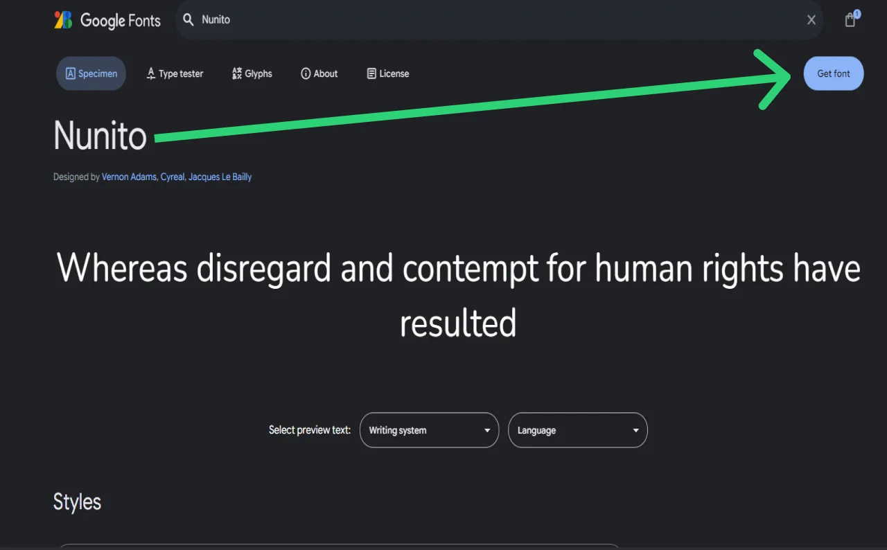
Link Google fonts downloaded to HTML code.
Regarding the typefaces we selected in our design—DM Sans and Nunito—there is a crucial restriction. Google Fonts are here. We must visit the Google Fonts website and set them to be used on our page. Here's what you should do:
◾Visit the Google Fonts page to find Nunito:
◾ Continue these for MD Sans.

Choose the Link option given in this screenshot to embed the font:

Click Copy code then copy the code into the index.html file head section as shown:
<head>
<meta charset="UTF-8" />
<meta name="viewport" content="width=device-width, initial-scale=1.0" />
<title>A Digital product Design Agency</title>
<link rel="stylesheet" href="assets/css/styles.css" />
<!-- Google Fonts Embed -->
<link rel="preconnect" href="https://fonts.googleapis.com" />
<link rel="preconnect" href="https://fonts.gstatic.com" crossorigin />
<link
href="https://fonts.googleapis.com/css2?family=DM+Sans:ital,opsz,wght@0,9..40,100..1000;1,9..40,100..1000&family=Nunito:ital,wght@0,200..1000;1,200..1000&display=swap"
rel="stylesheet"
/>
</head>
Open the Developer Tools in your browser and review the Fonts tab to ensure the Google fonts we have downloaded are functioning as intended:

Setting up the colors.
Choosing colors for the page comes next as a crucial phase of the process. Making CSS variables is the best approach to do this as color is a property used somewhat often on web pages. See more about establishing CSS variables.
Top the styles.css file with a root pseudo selector and build color variables within it:
/* CSS variables */
:root {
--color-white: #ffffff;
--color-white-300: rgba(255, 255, 255, 0.3);
--color-white-800: rgba(255, 255, 255, 0.8);
--color-black: #000000;
--color-primary: #595e64;
--color-secondary: #3b3e43;
--color-brand: #57b3fe;
--color-highlight: #00a077;
--color-dark: #0d0d0d;
--color-orange-300: #ffe7db;
--color-orange-600: #fead86;
--color-green-300: #e7f2ef;
--color-green-400: #c0f2ef;
--color-green-500: #51a690;
--color-green-600: #00a198;
--color-yellow-300: #faf3d8;
--color-yellow-400: #ffcf00;
--color-purple-300: #ede7f2;
--color-purple-600: #75578e;
--color-blue-300: #d8f0fa;
--color-blue-600: #0985b9;
--font-dm-sans: "DM Sans", "Arial", "Helvetica", sans-serif;
--font-nunito: "Nunito", "Arial", "Helvetica", sans-serif;
}
Update the headings.
Design dictates that the headers H1–H6 have common typographic features:

So, let’s set that up in CSS as well:
/* h1-h6 has default margin top/bottom */
h1,
h2,
h3,
h4,
h5,
h6 {
margin: 0 0 20px;
font-family: var(--font-dm-sans);
font-weight: 500;
color: var(--color-primary);
}
Set up the icons.
Icomoon typeface icons will be used in this work. You therefore first have to arrange them. For comprehensive instructions on how to build custom icons on Icomoon, see the relevant part at the conclusion of this page.
Once you have completed customizing Icomoon icons, their codes may be used inside the CSS rule sets this way: src: url( "../fonts/icomoon.ttf?z8q1or") within the @font-face rule established after the body rule set. This is the CSS code:
/* Typography */
body {
font-family: var(--font-nunito);
font-size: 16px;
line-height: 24px;
font-weight: 300;
color: var(--color-primary);
}
/* Icomoon font styles */
@font-face {
font-family: "icomoon";
src: url("../fonts/icomoon.ttf?z8q1or") format("truetype"),
url("../fonts/icomoon.woff?z8q1or") format("woff"),
url("../fonts/icomoon.svg?z8q1or#icomoon") format("svg");
font-weight: normal;
font-style: normal;
font-display: block;
}
[class^="icon-"],
[class*=" icon-"] {
/* use !important to prevent issues with browser extensions that change fonts */
font-family: "icomoon" !important;
speak: never;
font-style: normal;
font-weight: normal;
font-variant: normal;
text-transform: none;
line-height: 1;
/* Better Font Rendering =========== */
-webkit-font-smoothing: antialiased;
-moz-osx-font-smoothing: grayscale;
}
.icon-clear:before {
content: "\e900";
}
.icon-close:before {
content: "\e900";
}
.icon-menu:before {
content: "\e901";
}
.icon-instagram:before {
content: "\e902";
}
.icon-twitter:before {
content: "\e903";
}
.icon-facebook:before {
content: "\e904";
}
.icon-bag:before {
content: "\e905";
}
.icon-graph:before {
content: "\e906";
}
.icon-search:before {
content: "\e907";
}
.icon-users:before {
content: "\e908";
}
.icon-chart:before {
content: "\e909";
}
.icon-discount:before {
content: "\e90a";
}
Additionally, transfer the Icomoon fonts files to the assets/fonts directory.

Style the sections and components.
Once the foundations of CSS style are clear-cut, you can start customizing the particular parts and components of our web page. Before you do that, however, we need talk about one very vital element of the design for the coding conversion process. Basically, this implies that regardless of the device a person is surfing a web page on, it should show equally effectively.
Two techniques—mobile-first and desktop-first—can help us create web pages that are responsive. Let us closely examine these approaches:
Mobile-First Approach
This approach creates a mobile view design by default and thereafter uses certain CSS breakpoints such varying device resolution pixels as start and finish points for decorating the page appropriately.
Standard breakpoints for the mobile-first strategy include desktop (min-width: 1024px and higher), tablet (min-width: 768px up to 1023px), and mobile (min-width: 320px or 375px up to 767px).
These are some typical breakpoints; yet, depending on a particular design, we may use any breakpoint value that we require.
A CSS media query drives web responsiveness from its core. This is like a magic spell allowing the appearance of your website to vary depending on the screen size under view.
For a large computer screen, for instance, you may choose one design; for a little phone screen, another. This guarantees that your website looks excellent and is simple to use on whichever device someone is looking at.
Media-Query Examples:
Default for mobile:
.example-div {
width: 50%;
padding: 10px;
}
For tablet (min-width: 768px up to 1023px):
@media (min-width: 768px) {
.example-div {
width: 33.33%;
padding: 15px;
}
}
For desktop (min-width: 1024px and up):
@media (min-width: 1024px) {
.example-div {
width: 25%;
padding: 20px;
}
}
Desktop-First Approach
This approach generates a desktop view design by default and modifies styles in line with the design using certain CSS breakpoints. Among the typical desktop-first breakpoints are tablet (max-width: 1023px), desktop (min-width: 1024px and greater without requirement for a media query), and mobile (max-width: 767px).
Examples:
For desktop:
.example-div {
width: 25%;
padding: 20px;
}
For tablet (max-width: 1023px):
@media (max-width: 1023px){
.example-div {
width: 33.33%;
padding: 15px;
}
}
For mobile (max-width: 767px):
@media (max-width: 767px){
.example-div {
width: 50%;
padding: 10px;
}
}
We have decided for our lesson to use a mobile-first strategy. Since most people nowadays use their cellphones to explore the internet, it is rather common in web development nowadays.
It's time to design the parts, making them cross-device compatible since you understand why responsiveness important and what methods to use in web development.
Follow these steps:
Define the generic container
/* Generic container styles */
.container {
width: 100%;
margin-left: auto;
margin-right: auto;
padding-left: 20px;
padding-right: 20px;
/* design container width is 1170px. So, with the left/right spacing of 20px,
the container box-model width becomes 1210px.
So, we are setting max-width to 1210px, which makes the container responsive because of the max-width property.
*/
max-width: 1210px;
}
Style the header section.
Start by looking at these header components' characteristics:
Logo
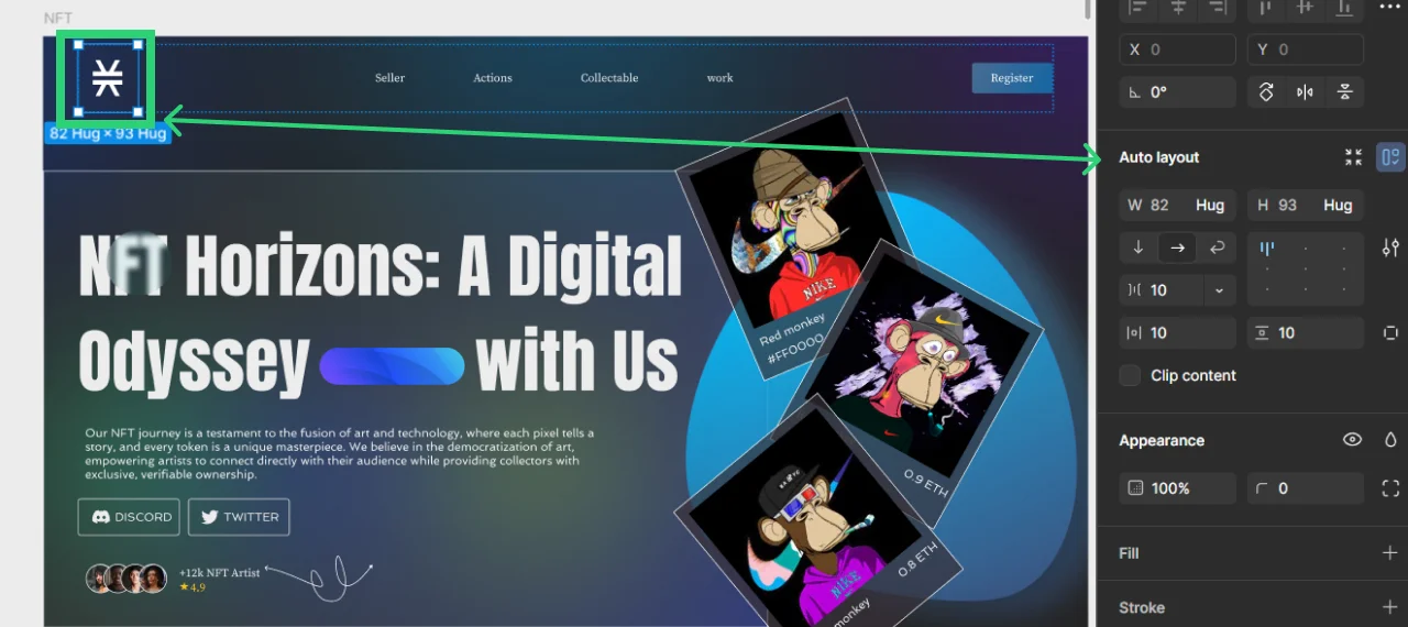
Menu Button (dimensions and typography)


Let's now focus on CSS. You must style the header using the header class rather than the id #header. Why? Classes are meant to provide designs we can recycle whenever there is a requirement for style inheritance.
The header styles will have the following classes:
◾Header class .header {}
◾Header logo header .logo {}
◾Header nav .header .nav {}
◾Header nav menu list .header .nav__menu
◾Header nav menu list li, a etc.
◾.header .nav__menu li {} and .header .nav__menu a {} etc.
◾Header button .btn which is generic / global style.
Here’s the code:
/* Header styles */
.header {
position: absolute;
top: 0;
left: 0;
width: 100%;
z-index: 999;
padding-top: 20px;
padding-bottom: 20px;
padding-left: 20px;
padding-right: 60px;
display: flex;
align-items: center;
justify-content: space-between;
}
.header .logo {
width: 120px;
}
.header .logo img {
display: block;
}
.header .nav__holder {
background: var(--color-brand);
position: fixed;
top: 0;
right: 0;
bottom: 0;
width: 280px;
transform: translateX(100%);
z-index: 999;
padding: 20px;
transition: transform 0.3s ease-in-out;
}
.header .nav__menu {
font-size: 16px;
line-height: 1.2;
font-weight: 500;
font-family: var(--font-dm-sans);
}
.header .nav__menu a {
color: var(--color-white);
transition: color 0.3s ease-in-out;
display: block;
padding: 5px 0;
}
.header .nav__menu a:hover {
color: var(--color-secondary);
}
.nav__opener {
position: absolute;
right: 20px;
top: 20px;
font-size: 28px;
color: var(--color-white);
}
.nav__opener--close {
display: none;
}
.nav--active .nav__opener--close {
display: block;
}
Generic Button styles:
/* Generic Button styles */
.btn {
display: inline-flex;
align-items: center;
justify-content: center;
padding: 6px 15px;
background: var(--color-white);
color: var(--color-brand);
font-family: var(--font-dm-sans);
font-weight: 700;
font-size: 12px;
line-height: 21px;
border-radius: 50px;
text-transform: uppercase;
transition: color, background 0.3s ease-in-out;
}
.btn:hover {
background: var(--color-secondary);
color: var(--color-white);
}
Let us then concentrate on header responsiveness. Instead of defining a style separately for every element, you must create one media-query for each breakpoint adding all styles within one media-query to do this. At the conclusion of the file following the preset styles, arrange these responsive designs.
Here is the code:
/* Responsive styles */
/* Tablet device and up */
@media (min-width: 768px) {
/* For header and menu we followed mobile styles */
}
/* Desktop small device and up */
/* For Desktop and up we updated the header and menu to match design layout */
@media (min-width: 1024px) {
.header {
padding-right: 20px;
}
.header .nav__holder {
position: static;
width: auto;
transform: none;
padding: 0;
background: none;
}
.header .nav__menu {
display: flex;
align-items: center;
gap: 20px;
font-size: 14px;
}
.nav__opener {
display: none;
}
}
/* Desktop large device and up */
@media (min-width: 1200px) {
/* For Desktop and up we updated the header and menu to match design values as well */
.header {
padding-left: 60px;
padding-right: 60px;
padding-top: 30px;
padding-bottom: 30px;
}
.header .logo {
width: 210px;
}
.header .nav__menu {
font-size: 16px;
}
.btn {
font-size: 14px;
padding: 20px 50px;
}
}
So, the final code for the header section looks like this:
/* General CSS reset and base styles */
/* CSS variables */
:root {
--color-white: #ffffff;
--color-white-300: rgba(255, 255, 255, 0.3);
--color-white-800: rgba(255, 255, 255, 0.8);
--color-black: #000000;
--color-primary: #595e64;
--color-secondary: #3b3e43;
--color-brand: #57b3fe;
--color-highlight: #00a077;
--color-dark: #0d0d0d;
--color-orange-300: #ffe7db;
--color-orange-600: #fead86;
--color-green-300: #e7f2ef;
--color-green-400: #c0f2ef;
--color-green-500: #51a690;
--color-green-600: #00a198;
--color-yellow-300: #faf3d8;
--color-yellow-400: #ffcf00;
--color-purple-300: #ede7f2;
--color-purple-600: #75578e;
--color-blue-300: #d8f0fa;
--color-blue-600: #0985b9;
--font-dm-sans: "DM Sans", "Arial", "Helvetica", sans-serif;
--font-nunito: "Nunito", "Arial", "Helvetica", sans-serif;
}
/**
* Set up a decent box model on the root element
*/
html {
box-sizing: border-box;
}
/**
* Make all elements from the DOM inherit from the parent box-sizing
* Since `*` has a specificity of 0, it does not override the `html` value
* making all elements inheriting from the root box-sizing value
* See: https://css-tricks.com/inheriting-box-sizing-probably-slightly-better-best-practice/
*/
*,
*::before,
*::after {
box-sizing: border-box;
}
/* body has default margin */
body {
margin: 0;
}
/* h1-h6 has default margin top/bottom */
h1,
h2,
h3,
h4,
h5,
h6 {
margin: 0 0 20px;
font-family: var(--font-dm-sans);
font-weight: 500;
color: var(--color-primary);
}
/* p tag has default margin top/bottom */
p {
margin: 0 0 20px;
}
/* ul/ol has default maring,padding and list style like bullets */
ul,
ol {
margin: 0;
padding: 0;
list-style: none;
}
/* anchor tag has default decoration underline */
a {
text-decoration: none;
}
/* Responsive image property */
img {
max-width: 100%;
height: auto;
}
/*
Page wrapper styles:
This style will not let any elements to overflow from the page wrapper
*/
#page-wrapper {
position: relative;
overflow: hidden;
}
/* Typography */
body {
font-family: var(--font-nunito);
font-size: 16px;
line-height: 24px;
font-weight: 300;
color: var(--color-primary);
}
/* Icomoon font styles */
@font-face {
font-family: "icomoon";
src: url("../fonts/icomoon.ttf?z8q1or") format("truetype"),
url("../fonts/icomoon.woff?z8q1or") format("woff"),
url("../fonts/icomoon.svg?z8q1or#icomoon") format("svg");
font-weight: normal;
font-style: normal;
font-display: block;
}
[class^="icon-"],
[class*=" icon-"] {
/* use !important to prevent issues with browser extensions that change fonts */
font-family: "icomoon" !important;
speak: never;
font-style: normal;
font-weight: normal;
font-variant: normal;
text-transform: none;
line-height: 1;
/* Better Font Rendering =========== */
-webkit-font-smoothing: antialiased;
-moz-osx-font-smoothing: grayscale;
}
.icon-clear:before {
content: "\e900";
}
.icon-close:before {
content: "\e900";
}
.icon-menu:before {
content: "\e901";
}
.icon-instagram:before {
content: "\e902";
}
.icon-twitter:before {
content: "\e903";
}
.icon-facebook:before {
content: "\e904";
}
.icon-bag:before {
content: "\e905";
}
.icon-graph:before {
content: "\e906";
}
.icon-search:before {
content: "\e907";
}
.icon-users:before {
content: "\e908";
}
.icon-chart:before {
content: "\e909";
}
.icon-discount:before {
content: "\e90a";
}
/* Generic container styles */
.container {
width: 100%;
margin-left: auto;
margin-right: auto;
padding-left: 20px;
padding-right: 20px;
/* design container width is 1170px so with left/right spacing of 20px,
the container box-model width becomes 1210px.
So we are setting max-width to 1210px which makes the container also responsive due to max-width property
*/
max-width: 1210px;
}
/* Header styles */
.header {
position: absolute;
top: 0;
left: 0;
width: 100%;
z-index: 999;
padding-top: 20px;
padding-bottom: 20px;
padding-left: 20px;
padding-right: 60px;
display: flex;
align-items: center;
justify-content: space-between;
}
.header .logo {
width: 120px;
}
.header .logo img {
display: block;
}
.header .nav__holder {
background: var(--color-brand);
position: fixed;
top: 0;
right: 0;
bottom: 0;
width: 280px;
transform: translateX(100%);
z-index: 999;
padding: 20px;
transition: transform 0.3s ease-in-out;
}
.header .nav__menu {
font-size: 16px;
line-height: 1.2;
font-weight: 500;
font-family: var(--font-dm-sans);
}
.header .nav__menu a {
color: var(--color-white);
transition: color 0.3s ease-in-out;
display: block;
padding: 5px 0;
}
.header .nav__menu a:hover {
color: var(--color-secondary);
}
.nav__opener {
position: absolute;
right: 20px;
top: 20px;
font-size: 28px;
color: var(--color-white);
}
.nav__opener--close {
display: none;
}
/* Generic Button styles */
.btn {
display: inline-flex;
align-items: center;
justify-content: center;
padding: 6px 15px;
background: var(--color-white);
color: var(--color-brand);
font-family: var(--font-dm-sans);
font-weight: 700;
font-size: 12px;
line-height: 21px;
border-radius: 50px;
text-transform: uppercase;
transition: color, background 0.3s ease-in-out;
}
.btn:hover {
background: var(--color-secondary);
color: var(--color-white);
}
/* Responsive styles */
/* Tablet device and up */
@media (min-width: 768px) {
/* For header and menu we followed mobile styles */
}
/* Desktop small device and up */
/* For Desktop and up we updated the header and menu to match design layout */
@media (min-width: 1024px) {
.header {
padding-right: 20px;
}
.header .nav__holder {
position: static;
width: auto;
transform: none;
padding: 0;
background: none;
}
.header .nav__menu {
display: flex;
align-items: center;
gap: 20px;
font-size: 14px;
}
.nav__opener {
display: none;
}
}
/* Desktop large device and up */
@media (min-width: 1200px) {
/* For Desktop and up we updated the header and menu to match design values as well */
.header {
padding-left: 60px;
padding-right: 60px;
padding-top: 30px;
padding-bottom: 30px;
}
.header .logo {
width: 210px;
}
.header .nav__menu {
font-size: 16px;
}
.btn {
font-size: 14px;
padding: 20px 50px;
}
}
Style the Hero section.
First look at the Hero Section components in the Figma design, same as with the header part previously.
Specify the Hero section default styles then:
/* Hero section styles */
.hero-section {
position: relative;
padding-top: 100px;
padding-bottom: 100px;
}
.hero-section__decor {
position: absolute;
top: 0;
left: 0;
width: 100%;
bottom: 100px;
z-index: -1;
}
.hero-section__decor img {
position: absolute;
top: 0;
left: 0;
width: 100%;
height: 100%;
object-fit: cover;
object-position: bottom;
}
.hero-section__info {
text-align: center;
color: var(--color-white);
margin-bottom: 20px;
}
.hero-section__image {
position: relative;
margin-bottom: -100px;
max-width: 500px;
margin-left: auto;
margin-right: auto;
}
Define the Hero section responsive styles:
/* Tablet device and up */
@media (min-width: 768px) {
/* For hero section we followed mobile styles */
}
/* Desktop small device and up */
/* For Desktop and up we updated the header and menu to match design layout */
@media (min-width: 1024px) {
...
/* hero section styles */
.hero-section {
padding-top: 150px;
padding-bottom: 150px;
}
.hero-section__decor {
bottom: 180px;
}
.hero-section h1 {
font-size: 48px;
line-height: 1.2;
margin-bottom: 20px;
}
.hero-section__info {
font-size: 18px;
line-height: 1.3;
}
.hero-section__image {
margin-bottom: -200px;
max-width: 800px;
}
}
/* Desktop large device and up */
@media (min-width: 1200px) {
...
/* hero section styles */
.hero-section {
padding-top: 150px;
padding-bottom: 250px;
}
.hero-section__decor {
bottom: 280px;
}
.hero-section__image {
margin-bottom: -300px;
max-width: 1230px;
}
.hero-section h1 {
font-size: 68px;
}
.hero-section__info {
font-size: 20px;
}
.hero-section__info p {
margin-bottom: 40px;
}
}
Style the Services section.
Specify the overall styles for the part on Services first:
/* Services Section styles */
.services-section {
position: relative;
z-index: 1;
padding-bottom: 50px;
}
.services-section__decor-img {
position: absolute;
bottom: 100px;
left: 0;
z-index: -1;
width: 200px;
}
.services-section__decor-img:last-child {
left: auto;
right: 0;
bottom: auto;
top: 0;
}
.services-section__intro {
margin-bottom: 30px;
}
.services-section__column {
margin-bottom: 25px;
}
/* Tablet device and up */
@media (min-width: 768px) {
.services-section__intro {
max-width: 50%;
}
.services-section__row {
display: flex;
flex-wrap: wrap;
margin-left: -15px;
margin-right: -15px;
}
.services-section__column {
width: 50%;
padding-left: 15px;
padding-right: 15px;
}
.services-section__decor-img {
width: 300px;
}
}
@media (min-width: 1200px) {
.services-section__column {
width: 33.33%;
}
.services-section {
padding-bottom: 100px;
}
.services-section__decor-img {
width: 500px;
}
.services-section__decor-img:last-child {
width: 700px;
}
}
Specify the reusable info-card component's styles next:
/* General styles for reusable component info-card */
.info-card {
display: block;
height: 100%;
position: relative;
border-radius: 10px;
box-shadow: 0 20px 50px 0 #3b3e430d;
background: var(--color-white);
padding: 15px;
}
.info-card h3 {
margin-bottom: 15px;
}
.info-card p strong {
font-weight: 500;
}
@media (min-width: 768px) {
.info-card {
padding: 25px;
}
}
@media (min-width: 1200px) {
.info-card {
padding: 45px 40px;
}
}
Specify the reusable icon-box component's styles:
/* General styles for reusable component icon-box */
.icon-box {
display: flex;
align-items: center;
justify-content: center;
position: relative;
width: 50px;
height: 50px;
border-radius: 15px;
background: var(--color-orange-300);
color: var(--color-orange-600);
font-size: 24px;
margin-bottom: 20px;
}
.icon-box--soft-green {
background: var(--color-green-300);
color: var(--color-green-500);
}
.icon-box--yellow {
background: var(--color-yellow-300);
color: var(--color-yellow-400);
}
.icon-box--bright-green {
background: var(--color-green-400);
color: var(--color-green-600);
}
.icon-box--purple {
background: var(--color-purple-300);
color: var(--color-purple-600);
}
.icon-box--blue {
background: var(--color-blue-300);
color: var(--color-blue-600);
}
At last provide the styles for the text-highlight reusable component:
/* Generic styles for text-highlight */
.text-highlight {
display: block;
text-transform: uppercase;
font-weight: 700;
font-family: var(--font-dm-sans);
color: var(--color-highlight);
margin-bottom: 25px;
font-size: 12px;
line-height: 1.3;
}
Style the Footer section.
At last we have descended to the lowest part of the page. Let’s style it. Follow these steps:
Specify the Footer's overall architectural style:
/* Footer styles */
.footer {
background: var(--color-dark);
color: var(--color-white-800);
padding-top: 40px;
padding-bottom: 30px;
text-align: center;
}
.footer .logo {
margin: 0 auto 25px;
}
.footer a {
color: var(--color-white-800);
transition: color 0.3s ease-in-out;
}
.footer a:hover {
color: var(--color-brand);
}
.footer__menu {
margin-bottom: 25px;
font-weight: 500;
}
.footer__menu li {
margin-bottom: 15px;
}
.footer__copyright {
margin-bottom: 20px;
}
.footer__bar {
border-top: 1px solid var(--color-white-300);
padding-top: 30px;
}
.footer__bar-menu li {
margin-bottom: 10px;
}
@media (min-width: 768px) {
.footer {
text-align: left;
}
.footer .logo {
margin: 0 0 20px;
width: 175px;
}
.footer__menu {
display: flex;
flex-wrap: wrap;
gap: 20px;
}
}
@media (min-width: 1024px) {
.footer__holder {
display: flex;
justify-content: space-between;
}
.footer__menu {
font-size: 16px;
}
.footer__bar {
display: flex;
justify-content: space-between;
}
.footer__bar-menu {
display: flex;
gap: 20px;
}
}
Specify the Social Network reusable component styles:
/* Social networks styles */
.social-networks {
display: flex;
align-items: center;
justify-content: center;
gap: 20px;
margin-bottom: 20px;
}
@media (min-width: 768px) {
.social-networks {
justify-content: flex-start;
}
}
Make the mobile burger menu.
The mobile menu is one item that calls for our attention before we sum up the evolution of our web page. It seems non-functional right now. We have to use a little JavaScript (JS) to make the menu interactive to solve this. Please find the following guidelines:
◾ Within the assets/js folder, create a Javascript file titled app.js.
◾ Just before the end of the body, use the script tag to connect this file to the HTML code inside index.html.
...
<!-- Scripts -->
<script src="assets/js/app.js"></script>
</body>
</html>
Including this Javascript into the app.js file:
// Load the JavaScript after all the DOM elements are loaded
document.addEventListener("DOMContentLoaded", function () {
initMobileBurgerMenu();
});
function initMobileBurgerMenu() {
const body = document.body;
const navOpeners = document.querySelectorAll(".nav__opener");
navOpeners.forEach((opener) => {
opener.addEventListener("click", () => {
body.classList.toggle("nav--active");
});
});
}
Troubleshooting Common Figma to HTML Conversion Issues
Even with careful steps, you might encounter common issues when converting designs to code. Don't worry, these are usually quick fixes! Here are some frequent problems and how to resolve them:
Images & Assets Not Displaying
If you see a broken image icon, first check your `src` path in the HTML. Ensure it's correct relative to your `index.html` file and that file names (including case sensitivity!) match exactly. Also, confirm the image file actually exists in the specified folder.
CSS Styles Not Applying
If your HTML looks unstyled, verify your stylesheet link in the `` section of `index.html` is correct (``). Double-check for typos in class or ID names between your HTML and CSS. Use your browser's developer tools (right-click -> Inspect) to see if styles are being overridden or if there are any CSS errors.
Layout Issues (Elements Misaligned/Overflowing)
When elements don't line up as in Figma, review your Flexbox or Grid properties. Pay attention to `display`, `justify-content`, `align-items`, and `gap`. Margins and paddings can also impact spacing; use browser dev tools to inspect the box model of elements.
Responsiveness Not Working on Different Devices
If your layout breaks on smaller screens, first ensure you have the viewport meta tag in your HTML (``). Then, carefully re-check your `@media` query syntax and breakpoints in your CSS. Test thoroughly using browser developer tools' responsive mode or actual devices.
Improving Your Webpage
We should now enter a crucial period of improvement and testing once we have gone over the major stages of creating the web page. Your website may look finished, but always space for development. You ought to do this:
◾ Examine and polish: Check your HTML and CSS code for correctness by matching it with the Figma design. Pixel Perfection browser extension features as Pixel Perfect Pro, Perfect Pixel, etc., let you precisely compare the design and make any required changes to match it closely.
◾ Cross- Browser testing: Check your HTML/CSS code in many web browsers to guarantee compatibility and consistent presentation.
◾ Test responsiveness here: Check your design's responsiveness and appropriate layout changes on many devices and screen sizes.
Apart from web page testing, you may enhance it in many other ways:
◾ Adopt the main online accessibility guidelines.
◾ For backdrop and ornamental visuals, make more use of vector elements like SVG.
◾ JavaScript will help the website to be more responsive to user interactions. One may add page scroll motion, for instance.
◾ List general, reusable components and arrange them so that you might utilize them again or inherit their qualities.
Showing Off Your Finished Work
Well done! You have effectively turned a figma design into a working web page. Present the outcome to your coworkers or acquaintances, therefore highlighting your own achievements. You may compare your web page to one produced by a professional developer.
Creating Custom Icons on the IcoMoon Platform
Finally, here are the instructions on creating Icomoon icons that mentioned earlier in the text.
If the prefabricated font icons from Iconmoon fit your design, you may utilize them straight away. Still, sometimes current icons deviate from the original. You must therefore design your own unique font icons in that situation. Apply these guidelines:
◾ Export all SVG icons and label them according to their purpose—chart.svg, search.svg, and so forth. Furthermore, there are already-existing icons from the IcoMoon platform.
Visit IcoMoon App Projects and start a new project:

You will have access to current free icons to use and the ability to build unique icons after establishing and loading a fresh project.
◾ Import your own SVG icons to create a font icon:

◾ Our symbols within the IcoMoon app show when the import is finished:

◾ Click on every symbol to choose one for generation.
◾ The icons have different colors, hence we must substitute a default color. You may therefore specify certain colors later using CSS. Click Remove All Colors to start.

◾ The icons are waiting for processing. Generate Font: Click here.

◾ Right now you should be seeing the icons. The Settings icon and a download button lurk at the app's bottom.

Though the generator generates basic CSS styles and files, we also offer choices including SCSS on the settings tab. We have chosen the default settings for this lesson.
◾ Click Download to get these files:

We only need style.css, the fonts folder, and selection.json. The latter is just a backup config file for our chosen icons; we can import this file into any IcoMoon project to apply the identical icon fonts data and settings.
◾ Include the Icomoon fonts and styles into our project. The IcoMoon CSS will by default possess these characteristics:

You must so include the right URL for our font resources. You may now use our HTML's font-icon class. For instance, we just need to supply the HTML selector this class name if we want to utilize icon-bag:
The result will resemble this:
You may now change this icon's CSS characteristics like color, font-size, etc.:
Final Words
As we wrap up this article on converting Figma designs to HTML/CSS, maybe it will be really beneficial for you. Making your website ideas come to life starts with design and then real coding, so understanding how to achieve it is very helpful.
If you prefer simpler alternatives, the experts can handle low-code/no-code solutions such Webflow, Hubspot, and other platforms to quickly get your site going without requiring coding.
Get in touch right now for a free quotation and a consultation!

Prince Jadiya holds the position of Chief Marketing Officer at Psdtohtmlninja.com, where he assists organizations in overcoming web development obstacles. He is also known for him informative and engaging blog posts.
Want to Convert Your Design into Code?
Fill the form below to get a quotation.
Previous Post
